Wednesday 27 March 2013
Monday 25 March 2013
Sunday 24 March 2013
Tuesday 5 March 2013
Evaluation question 1 - What have you learned from your audiences feedback?
When deciding upon audience feedback and how to analyse the data I wanted to gather I decided that I should use an online survey website. The website I used was "Surveymonkey.com" which allowed me to create a questionnaire and then embed the links to social networking sights such as Facebook, this increases the chances of more people filling out my questionnaire and as such should give me more varied results. The one reason why I used an online questionnaire opposed to a hard copy version is because the website automatically compiles the results and breaks down the data into a chart for you, this not only saves time but also makes it easy to analyse the data given to you. I only received few results, although they are still of use to me as they give me a general overview of opinions, regarding my media products.

The first question I asked was how old those filling out the questionnaire were. Five of the people who filled it out were between the ages of 15-19 whilst one person was either 40 or over. The vast majority of the audience who filled it out fit our groups initial age range 15-19 which we decided would be our target audience when choosing a genre of music to create media texts for. This is particularly helpful as it will give me an insight into what the target audience thought of my media texts.

The second question was what gender those filling out my questionnaire were. 2 of those who filled out my questionnaire were females and 4 of them were males. This means that the responses I get will be male dominated and therefore their opinions may be different to those put forward by males. Furthermore when we were conducting our initial research it was decided that our target gender would be females as many indie bands have a "sex appeal" to them. Due to only 33% of my responses being females the information doesn't cater to my needs of my target audience. However the information is still useful as it still voices an opinion about the work I created, even if the opinion is not from the exact audience I wanted.

I used this question to see if I had been successful in representing the band as an Indie Rock band. This was an important question to ask because if I had been unsuccessful in representing the band in the correct way I would have failed in creating media texts to accompany them. However as you can see 5 out of the 6 people said that they thought the band came across as an Indie Rock band, whilst the other person thought the band looked like a Classic Rock band, which overall falls into the massive genre that is classified as "Rock". This proves that I must have kept some of the key features that are seen across the Indie Rock genre otherwise people would have seen the band portrayed in a different style.

In this question I asked if the media texts were synergistic in any way and the response I got from most people was that the colour scheme was similar throughout the range of products. "The use of colours was your strongest link". "The colour scheme and digipak has an indie feel to it". However someone suggested that perhaps the style of the website, I created, didn't match the other two media texts. "I would say the colour scheme of the website doesn't match the other two media texts". The suggestion of the websites colour scheme was only suggested by one person, with the vast majority giving positive feedback saying all the products had a level of synergy to them. From the feedback that I have gathered I've learned that the audience does pick up on things such as colour, costume and style and link them together in their mind to see if multiple texts are linked.
 As a group when we were initially coming up with ideas for our band and seeing how they could be represented we came up with the concept of the being portrayed as patriotic, down to Earth, innocent, naive and like all Indie bands fun. This question focused on how people thought the band had been represented across all three media texts, allowing me to see if I was successful in representing the band the way I intended to. 4 of the 6 people said that the band had been portrayed as fun, 1 person said they looked patriotic and the other person said that they had been portrayed as looking "Down to Earth". The responses that I got off those who completed the questionnaire supported that I had portrayed the band in the correct way if I was intending them to be a fun loving Indie band, that has become typical of the genre.

One question that I was interested in asking was whether or not the audience thought that the way I represented the artist was similar to the way any other artist has been represented. When we were initially planning what ideals the band should have and how they should appear we came up with a list of artists who we drew inspiration from; the list of artists consisted of bands such as The Kaiser Chiefs, Arctic Monkeys and Arcade Fire. All these bands are portrayed as young, innocent and possibly naive which is a way we wanted the band to be shown in the eyes of the media. As you can see two people both said that "The Lost Boys" were shown in a way that reminded the of The Arctic Monkeys, which means that, to a degree, I succeeded in portraying the band to other successful Indie bands. "I suppose other Indie bands in general?"
 The next question I asked was if people would be inclined to pick up the CD if they saw the cover in a store. The overall theme of the answers I got in return was that the digipak looks interesting and people would be inclined to pick it up, even if they wouldn't buy it. "Yes, it looks very interesting." and "I would be interested, the people are around my age looking at them and I can probably relate to them." The overwhelming positive responses, back up the idea that I have created a successful digpak that is engaging and also has some key characteristics that the Indie genre entails, such as a vibrant use of colour. "A lot of interesting colours are used" and "Because it's colourful". This just proves that use of colour is important when trying to market something.
 Another strongly opinionated question that I wanted to find out was whether or not people would continue to use the homepage I had created after they had initially started to use it. 100% of those I asked said that they would continue to use it one they had started to. This would allude to the navigation being set out in a way that is easy to use and navigate a website, because if the website wasn't laid out in a way that is easy to navigate around the audience I asked, probably, would have said no, they wouldn't want to continue to use the website once they had initially started to use it.
 One of my more varied questions in my questionnaire was a question asking people to rate the video out of 10, with one being the lowest and 10 being the highest. As you can see from the data to the left 2 people rated it 7, 3 people rated it 8 and 1 person rated it 9, giving an average of around 8. From this data we can deduce that the video excelled in, unspecified, areas but was perhaps not as interesting as it could have been. When linked with the question after it "What improvements would you suggest to improve the video?" I am able to see what could have perhaps been changed to make the video more enjoyable and fit the Indie genre in a more well rounded manner.
There were three suggestions that were given to me by those who answered the questionnaire on ways I could improve the video. The first was that I should use "Faster shots" by this I assume that the person means that when I was editing the video I could have perhaps added in more shots decreasing the average shot duration. Decreasing the average shot duration would make the video appear more hectic and fit the more intricately layered bits of the music. The second suggestion was more of a statement than a question "Some of the shots don't make sense? Like when they're standing in the corner dancing together?" Jamie and I used this shot to show the fun loving nature of the band although I can understand what the person who said this is getting at, instead of just filling time in the video with a couple of random shots we could have added a few shots that would progress the narrative further. The final suggestion was that the narrative was too confusing to be grasped as a concept straight away and that perhaps it could have been explained in more depth. However I feel that explaining the narrative would perhaps seem like I was dumbing down the narrative and questioning the intelligence of the audience and not leaving open for interpretation. A way I could have met in the middle with the person answering the question was that I could have focused more on effects, drawing a clear distinction between the narrative and performance shots.


The first question I asked was how old those filling out the questionnaire were. Five of the people who filled it out were between the ages of 15-19 whilst one person was either 40 or over. The vast majority of the audience who filled it out fit our groups initial age range 15-19 which we decided would be our target audience when choosing a genre of music to create media texts for. This is particularly helpful as it will give me an insight into what the target audience thought of my media texts.

The second question was what gender those filling out my questionnaire were. 2 of those who filled out my questionnaire were females and 4 of them were males. This means that the responses I get will be male dominated and therefore their opinions may be different to those put forward by males. Furthermore when we were conducting our initial research it was decided that our target gender would be females as many indie bands have a "sex appeal" to them. Due to only 33% of my responses being females the information doesn't cater to my needs of my target audience. However the information is still useful as it still voices an opinion about the work I created, even if the opinion is not from the exact audience I wanted.

I used this question to see if I had been successful in representing the band as an Indie Rock band. This was an important question to ask because if I had been unsuccessful in representing the band in the correct way I would have failed in creating media texts to accompany them. However as you can see 5 out of the 6 people said that they thought the band came across as an Indie Rock band, whilst the other person thought the band looked like a Classic Rock band, which overall falls into the massive genre that is classified as "Rock". This proves that I must have kept some of the key features that are seen across the Indie Rock genre otherwise people would have seen the band portrayed in a different style.

In this question I asked if the media texts were synergistic in any way and the response I got from most people was that the colour scheme was similar throughout the range of products. "The use of colours was your strongest link". "The colour scheme and digipak has an indie feel to it". However someone suggested that perhaps the style of the website, I created, didn't match the other two media texts. "I would say the colour scheme of the website doesn't match the other two media texts". The suggestion of the websites colour scheme was only suggested by one person, with the vast majority giving positive feedback saying all the products had a level of synergy to them. From the feedback that I have gathered I've learned that the audience does pick up on things such as colour, costume and style and link them together in their mind to see if multiple texts are linked.


One question that I was interested in asking was whether or not the audience thought that the way I represented the artist was similar to the way any other artist has been represented. When we were initially planning what ideals the band should have and how they should appear we came up with a list of artists who we drew inspiration from; the list of artists consisted of bands such as The Kaiser Chiefs, Arctic Monkeys and Arcade Fire. All these bands are portrayed as young, innocent and possibly naive which is a way we wanted the band to be shown in the eyes of the media. As you can see two people both said that "The Lost Boys" were shown in a way that reminded the of The Arctic Monkeys, which means that, to a degree, I succeeded in portraying the band to other successful Indie bands. "I suppose other Indie bands in general?"


There were three suggestions that were given to me by those who answered the questionnaire on ways I could improve the video. The first was that I should use "Faster shots" by this I assume that the person means that when I was editing the video I could have perhaps added in more shots decreasing the average shot duration. Decreasing the average shot duration would make the video appear more hectic and fit the more intricately layered bits of the music. The second suggestion was more of a statement than a question "Some of the shots don't make sense? Like when they're standing in the corner dancing together?" Jamie and I used this shot to show the fun loving nature of the band although I can understand what the person who said this is getting at, instead of just filling time in the video with a couple of random shots we could have added a few shots that would progress the narrative further. The final suggestion was that the narrative was too confusing to be grasped as a concept straight away and that perhaps it could have been explained in more depth. However I feel that explaining the narrative would perhaps seem like I was dumbing down the narrative and questioning the intelligence of the audience and not leaving open for interpretation. A way I could have met in the middle with the person answering the question was that I could have focused more on effects, drawing a clear distinction between the narrative and performance shots.

Friday 15 February 2013


Wednesday 13 February 2013
Adding effects to the video - 13/02/2013
Today Jamie and I added effects to our elevator shots so that the audience are able to make a clear distinction between the elevator narrative shots and the performance shots. We added the effects "Echo" and "Bloom" which add more of a dream like appearance to the video. The "Echo" effect causes the video to split in to layers and then place a time gap between the layers causing multiple copies of one thing, one after the other. The "Bloom" effect adds a shine to light areas making them stand out against shadowed ares, drawing attention to it. We decided upon the use of these two effects because it is a convention that is often linked with fictional machines such as time machines like the famous Tardis in Doctor Who.
Near the end of the video we added one final effect called "Earthquake" which violently jolts the screen about, depending on how high the mix is. We thought that because the video gets more upbeat it would work well with the tempo of the music, the more the video progressed at the end the more we increased the "Earthquake" effect, the mix of it increased by 10% each time so at the end it goes from 50% to 60% to 70% to 80% to 90% to 100%.
One key feature that has to be understood to get the most out of using effects on final cut is using keyframes, which allows for more diverse editing, this is because you are able to increase or decrease certain options of an effect over a duration allowing for more interesting finals results. Jamie and I both used key frames when adding effects to our music video, and I feel that without them the video wouldn't be as well defined as it, perhaps, is now.

Wednesday 6 February 2013
Final Rough Cuts - 06/02/13
This is what me and Jamie have edited so far, there are no effects or transitions on the video at the moment and they will come after we have sorted out a couple of other issues. There are two main issues with what we have produced so far, the first being that the aspect ratio of a couple of our shots near the end aren't the correct size and will need to be changed. To do this all that has to be done is have a clip selected and then go to the "Motion" menu and select the distort sub menu, this will bring up a couple of options which allow you to edit how the video looks. What we have to do to change the ratio is move the aspect ratio slider to the size we want, which is -42. The second problem we have is that you are able to see under the border of some of the clips, to solve this problem we are going to have to delete the tracks that are positioned beneath the top ones in the timeline as Final cut plays all layers that aren't hidden. When doing this we need to make sure that no clips that we are actually using will be deleted, if the are positioned on a lower tier of the timeline.
Editing the speed for a clip 05/02/13
This video is of me and Jamie explaining a situation that we had about the speed of one of clips in the bass narrative, we decided that it needed speeding up so we had to adjust and choose the speed most suitable for the situation.
Peer review - 23/01/13
Today in lesson Teni and Kayleigh reviewed what Jamie and I have edited so far in the music video. What they had to say was that we needed to add an effect or two to the narrative or elevator sequences to make a clear distinction between the narrative and performance shots. They also suggested that we should perhaps work at a faster pace as that will allow us to tweak the small fiddly aspects of the music video with more ease as we won't be pressured as much by the looming deadline.
Wednesday 30 January 2013
Starting the rough cuts - 05/02/13
Today Jamie and I began the process of putting our rough cuts together for the music video, we decided not to add any effects or transitions until the majority of the shots were all roughly in the correct position on the timeline. This will allow us to focus more upon the use of effects as we'll know everything is all ready ordered correctly and in time, in addition we'll also know what is coming up next in the video.

Wednesday 23 January 2013
Editing - the synching process

Tuesday 22 January 2013
Another filming difficulty
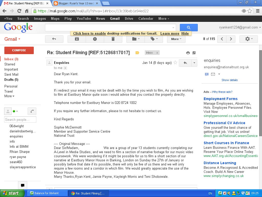
We have had another difficulty filming at our original intended location, Valentines Mansion, as the building is currently under renovation and parts of it are unsafe to the general public. When we first heard about this we decided that we should just find another building of heritage and see if we would be able to film there, there is only one other building of heritage near us which is Eastbury Manor House so we got in contact with them and asked if we would be able to film there. However we were soon informed that the Manor House was also closed and the next available date that we would be able to use it for filming would be on Saturday the 9th of February, this posed us with a problem as there was no doubt that it was far too long a time to wait to film. Much earlier in the planning process we came up with an idea which we could use should filming at the mansion fall through, the basis of the idea was to turn an art classroom into somewhat of an art gallery and film in there. As we were unable to film at both of the mansions we decided that we should revert to our back plan, we will be filming it on Wednesday 23rd January.

What we have left to film
Today we discussed what else we needed to film before we are able to start editing all of our footage together. There are two pieces that we have left to film which involve filming at Valentines Mansion to complete the bass narrative which we plan to have occurring roughly half way through the music video. In addition we have to film one more section of elevator shots which will be used to help progress the narrative further in the video. We will have to arrange two more days to film in the near future to make sure that all our filming is completed as quickly as possible so we are then able to start editing earlier, which will give us more time to focus on the editing stage.
We also need to take some pictures that synergistically link with the rest of our media text to use within the digipak that we have to create.
We also need to take some pictures that synergistically link with the rest of our media text to use within the digipak that we have to create.
Tuesday 8 January 2013
Subscribe to:
Posts (Atom)