Today in lesson we focused on the creation
of digipaks, more specifically editing the
images for the front and back cover. We had to try and
use existing images and edit them in the style of the Indie genre to
help us when we actually go to create our digipak. One of the criteria that we
need to meet for the digipak is
that a song list needs to be put on the back cover along with a bar code
because that is how the digipak would
look if it was created in the "real world."


I originally
started with the front cover and decided that the best image I could use was
just a flat angle long shot of four men sitting at what appeared to be
somewhere underground, most reminiscent of a London underground station which
can be seen from the design of the tiles behind the men. When I thought about
it I liked the idea of having the front and back cover underground as it adds a
sense of recognition that most people living in big cities can relate to. When I
have looked at other existing Indie digipaks and videos many of the texts have a
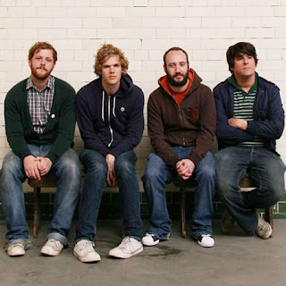
modernised retro look so I tried to achieve this as well by adding an effect that makes images appear like they are being viewed in an old photo frame. This effect was applied to both the front and back cover so that synergy is created between the two, in addition I muted the colours on both images so that the images appear older and less vibrant. The last thing I added to the front cover was the name of the band "The Lost Boys" in green font, however I was unsure of where to put the name and in the end I put it in the centre of the cover which doesn't look particularly professional and also breaks the natural illusion that the rest if the digipak conveys.

When it came to the back cover I thought that a tunnel would work really well as it fits the simplistic nature of the front cover and it also conveys the misé-en-scene very well. I added very few effects to the picture and the only extra effect that I added on top of those that I used on the front cover was burning the shadows cast from the lights to make those areas darker and stand out more. After finishing the way I wanted the back cover to look I then had to add the track list and bar code, I started with the track list so I would know how much space I would have to play with to incorporate the bar code on the cover. I thought that the idea of black and white alternating track names would look interesting on the text and once I done changed the colours of the track names I deduced that it looked better than just one colour all the way through. Originally I had the track names horizontally but it didn't fit the cover that well so I changed the angle that each one was positioned at so that they looked like they were running down the tunnel wall. Once I had finished adding the track names to the back of the cover I added the bar code, where I initially placed it was where it stayed in the bottom left hand corner of the cover.
 I originally
started with the front cover and decided that the best image I could use was
just a flat angle long shot of four men sitting at what appeared to be
somewhere underground, most reminiscent of a London underground station which
can be seen from the design of the tiles behind the men. When I thought about
it I liked the idea of having the front and back cover underground as it adds a
sense of recognition that most people living in big cities can relate to. When I
have looked at other existing Indie digipaks and videos many of the texts have a
modernised retro look so I tried to achieve this as well by adding an effect that makes images appear like they are being viewed in an old photo frame. This effect was applied to both the front and back cover so that synergy is created between the two, in addition I muted the colours on both images so that the images appear older and less vibrant. The last thing I added to the front cover was the name of the band "The Lost Boys" in green font, however I was unsure of where to put the name and in the end I put it in the centre of the cover which doesn't look particularly professional and also breaks the natural illusion that the rest if the digipak conveys.
 When it came to the back cover I thought that a tunnel would work really well as it fits the simplistic nature of the front cover and it also conveys the misé-en-scene very well. I added very few effects to the picture and the only extra effect that I added on top of those that I used on the front cover was burning the shadows cast from the lights to make those areas darker and stand out more. After finishing the way I wanted the back cover to look I then had to add the track list and bar code, I started with the track list so I would know how much space I would have to play with to incorporate the bar code on the cover. I thought that the idea of black and white alternating track names would look interesting on the text and once I done changed the colours of the track names I deduced that it looked better than just one colour all the way through. Originally I had the track names horizontally but it didn't fit the cover that well so I changed the angle that each one was positioned at so that they looked like they were running down the tunnel wall. Once I had finished adding the track names to the back of the cover I added the bar code, where I initially placed it was where it stayed in the bottom left hand corner of the cover.


No comments:
Post a Comment